I spread the pattern on the floor and then got an overhead shot of it from my 2nd floor loft. I printed the jpg out on plain paper, then used the copier to enlarge it to fill a full 8.5x11 page and printed that out in black ink.
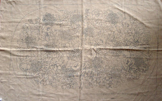 |
| Rapture - Jane McGown-Flynn - 72 x 44 |
Maybe I should have ironed it first! It worked out anyway...
The colors are not an exact representation of the colors I plan to use, but it helps define the elements. As I was coloring it I thought there were too many roses on one side and not enough on the other. I quickly realized that some of what I thought were Morning Glories were actually rose buds. The rug is not exactly symmetrical, but it is balanced.
At this point, it is a good idea to run a pencil firmly down the lines marking the edges of the pattern to ensure the pattern is drawn straight. It can be annoying (and sometimes impossible to fix) when the pattern is drawn crooked and you don't discover it until you have a lot of hooking in.
Now I'm rather to start some wool gathering and dying.

No comments:
Post a Comment